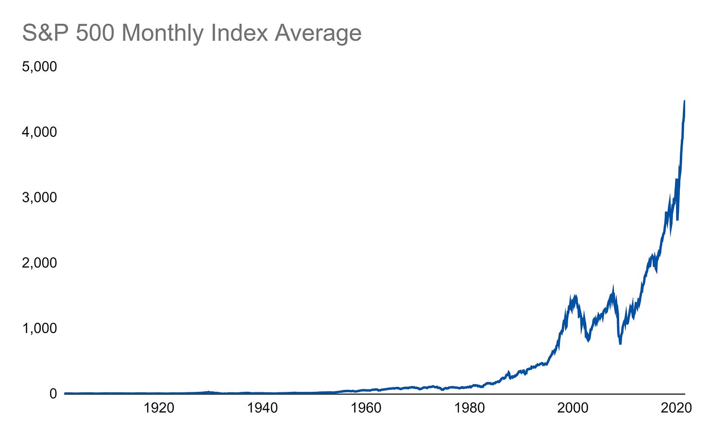
Here is a monthly average of the S&P 500 from September 2021 all the way back to October 1901 (yes, don’t we all fondly remember that October like it was just yesterday):
Since the market does not grow linearly over time, any period before around 1950 appears flat around zero (though you can see a very small blip for the 1929 bubble if you look closely). One way to alleviate that is to take the natural log of the S&P 500:
Now, things look a little more linear starting around 1940.
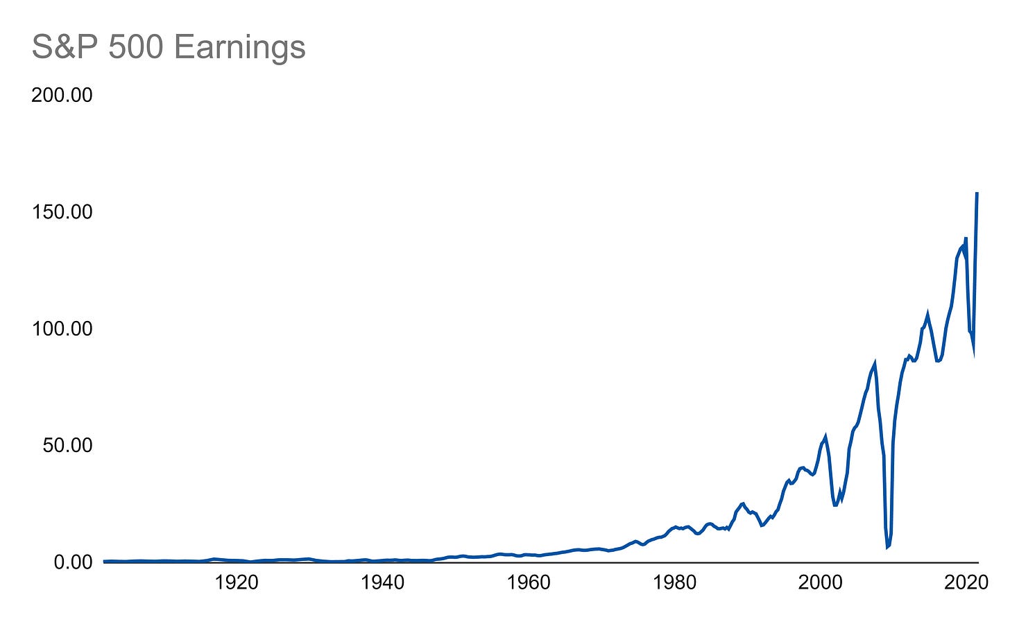
Another way we can adjust the S&P 500 is to benchmark it against something else. Earnings is a good option:
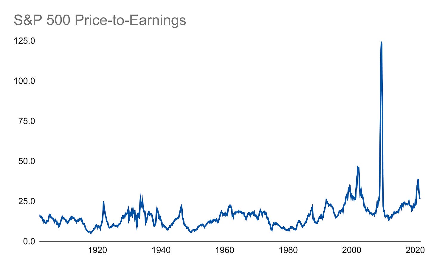
The classic move is to divide price (in this case the index value) by earnings:
The outlier here that mucks up this chart is the 2008 Financial Crisis. Earnings collapsed to almost nothing and blew out the ratio.
We can also take the flip side of that ratio and divide earnings by the index to get a yield:
This one looks a little neater to evaluate over time to get a better understanding of the market. We can even see that stocks had many periods of double digit percentages in yield! That’s hard to fathom in the current low yield environment and is just one way metrics like these can help us get a better picture of today’s investing environment.
Links
Most Popular Posts | All Historical Posts | Main Site | EM100 | EM1000 | Contact


