
A Debt Dashboard
Trying out a new tool
A couple of weeks ago, I walked through some metrics on US debt. Today, I’ve got something related but a little bit different than what I normally post about. That’s because I’ve decided to take data I usually cover and use a new reporting format. Here’s a screenshot of it:
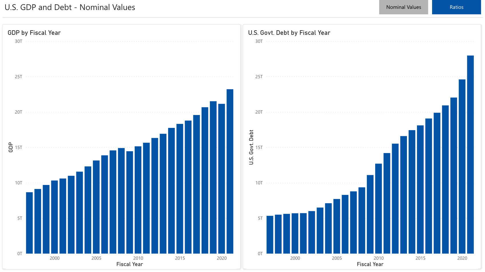
And, here is another:
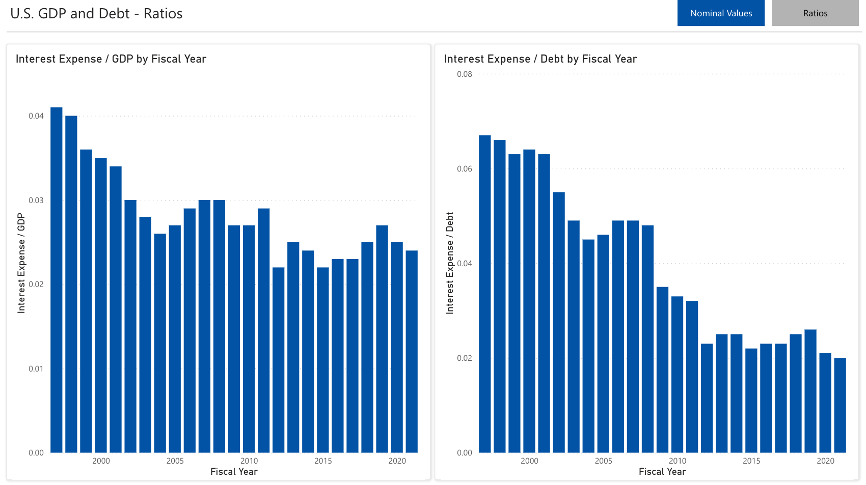
These are both live charts in a dashboard through Power BI and they are hosted outside of the newsletter on a stand-alone page. You can click here or use the button below to access the dashboard:
I’m curious to see what people think of this! Feel free to drop me a note or offer other ideas for data visualizations that may be of interest in this kind of format - I am just getting familiar with the capabilities of the tool but there are a ton of really cool things that could be built that may be of use to you as a reader!
Have a question you want to ask or a topic you’d like to see covered? Let me know!
Links
Most Popular Posts | All Historical Posts | Main Site | EM100 | EM1000