Recently, I’ve been doing a deeper dive on Apple’s fundamental data to walk through some important stock metrics in a simple way. This mini-series might be too simple for some people because I’ve noticed a recent net negative subscriber count trend over the last few days! So, if you are a master with stock analysis and this is all too easy and boring, don’t worry, I’ll be using each of these metrics to do more interesting and complicated analysis on the broader market that will be more insightful than common ratios you can find about a company at any given time.
That being said, I still think it’s really important to go through these metrics in a clear way for anyone new to this. I try to explain these things as I wish someone would have explained them to me when I was first getting started. So, I hope these posts are useful to a certain subset of the audience.
Further, once I get through these walkthroughs, I can organize them into a stand-alone guide I can just reference in the future, so I won’t have to explain them over and over again in future posts.
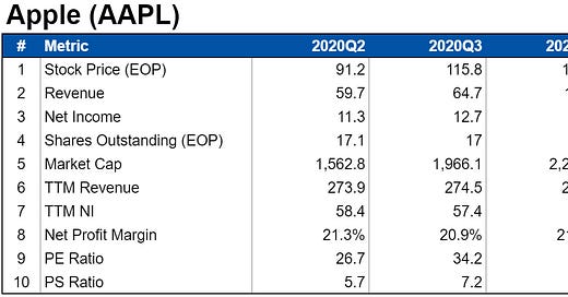
To continue with the series then, I put together a simple table that summarizes some of the recent stock metrics in a simple table:
I’ll be building this table over time as we discuss even more of these metrics. That way, we will have a simple format to use whenever we mention any stock (for example with ones I might be buying).
The one other thing I wanted to point out here was just how many useful ratios and numbers result from just a few inputs. We have ten rows in this table but only four of those rows are inputs - the rest are simple calculations that tell us a lot about the company we are looking at.
The point here is, never underestimate how many ways data can be analyzed to give new insights. We’ll be doing plenty of that in the next few posts and then adding even more input data to build out a ton of metrics we can use to analyze all sorts of different stocks!
Links
Yesterday’s Post | Most Popular Posts | All Historical Posts | Main Site | Contact


