
Analyzing post-downturn recoveries
It's always a longer ways up than you think
I’ve used the following chart many times recently when putting the current market downturn into historical context:

As we are currently in the tenth worst downturn going back to the Great Depression, it is important to understand what it would take to move up the list. One way is to consider the downside (i.e. we dropped -23.6% and need to fall more than -27.1% to be worse than the bear market brought on by Volker).
However, we can also invert that question and ask how much the market would need to rally to get us from the bottom of the downturn back to a new all-time high:
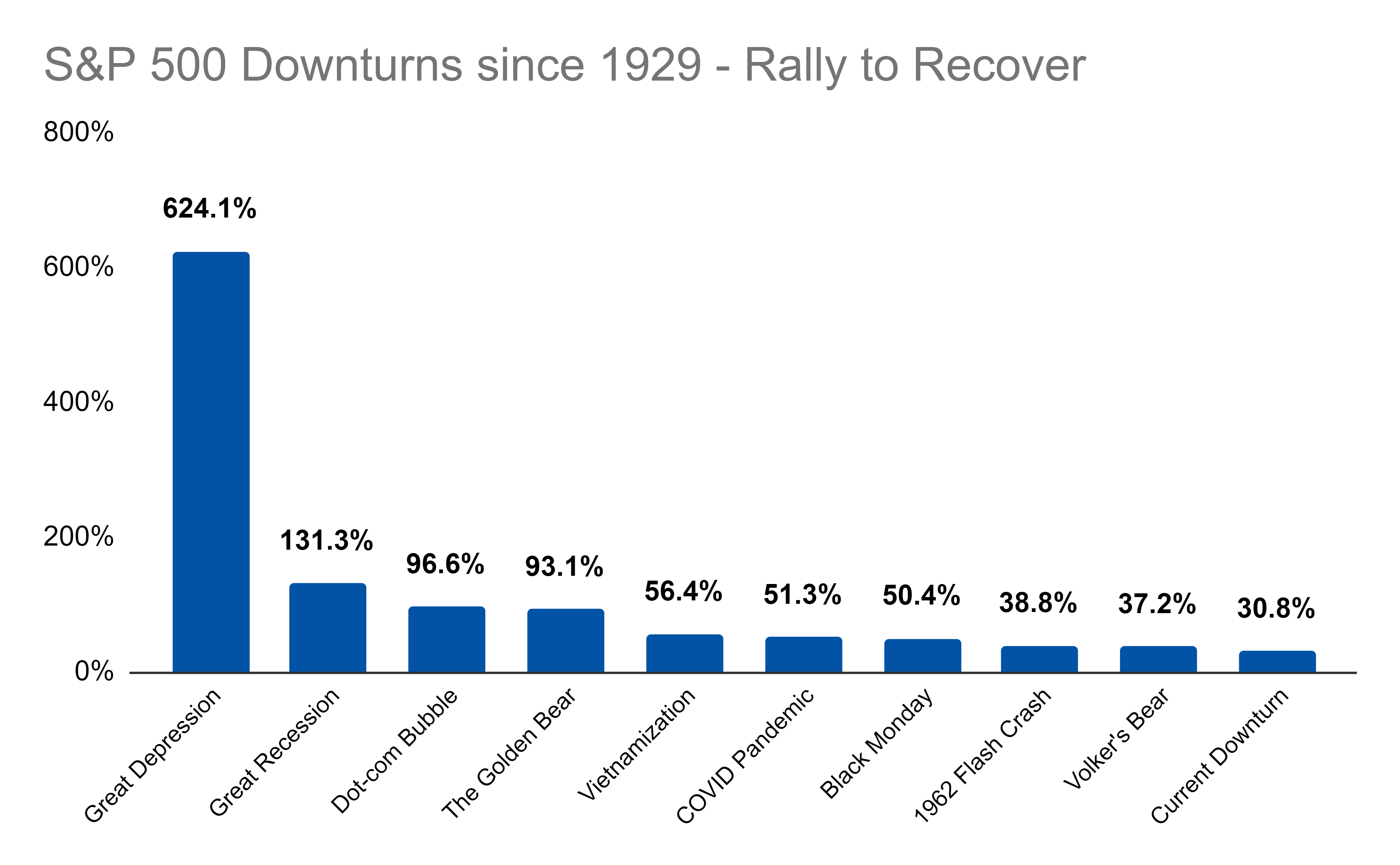
As for the current downturn, we need a 30.8% rally from the low. That’s not horrible.
However, if we go down more and more the pressure ramps up quickly. That’s because, each percentage of decline increases the rally needed by a more than linear rate. Hence why the Great Depression looks so much worse on this chart!
Ultimately though, if we are around the bottom, the upside looks fairly attractive. The key there is, having extra cash to throw around to capture that rally. Easier said than done.