


Correlation - Stocks and Bitcoin
Return similarity
On any given day, the stock market moves up and down. Other investments, like bitcoin, also go up and down. The important factor is that they don’t move perfectly up and down in the same exact way.
Sometimes, bitcoin has a really good day and stocks do not. Or stocks have a good day and bitcoin does not. Or they both have good days or bad days or…you probably get it by now.
One way to visualize what two investment returns are doing over some period of time is to chart the returns on a scatter plot:
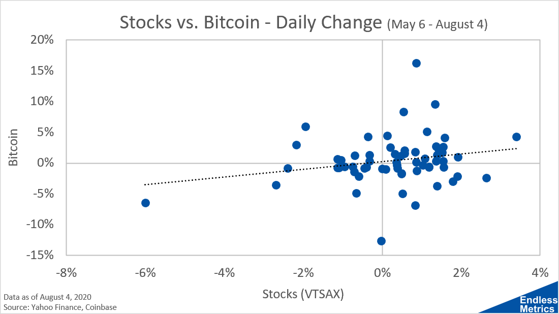
This is yet another way to analyze the bitcoin and stock example we have been looking at for the last few weeks. For any given dot, we can see both returns at once as a two dimensional space. It looks messy!
However, we can’t really look at this chart and make some easy assumption about whether bitcoin and stocks move together. It really looks more like there is no pattern at all.
If we look at the trend line, we see that there is a slight positive trend but just barely. Also, since this sample size is fairly small, it is not very significant from a statistical perspective.
We would say here that there is slight positive correlation between the returns. Using a calculated number in this example, the value for correlation is about 0.22.
Correlation runs between -1 (perfect negative correlation) and +1 (perfect positive correlation). Zero is right in between and means no correlation either positive or negative, so 0.22 quantifies our visual intuition that the scatter plot is more of a mess than some significant trend.
The important takeaway from scatter plots is that, with this visualization, we can quickly get a sense of two return behaviors at once by looking at the relative spacing of returns and their quadrant locations.
For investments, negative correlation is really powerful to increase diversification benefits. That means, we want to see lots of dots in the top left and bottom right quadrants, meaning one return was positive and one was negative. Returns in the top right and bottom left mean the investments moved in the same way (positive correlation).
Ultimately, we now have two extra tools in our analysis kit: a visualization of returns and a quantitative number for correlation. It’s important to use both! No tool is perfect and they should be used in combination with every other tool at your disposal because, at the end of the day, investing is basically giving your money away and hoping to get something back in return. So, choose wisely and do your homework!
Now do stocks v gold