
Creating Guidelines for Real Net Worth
When things run a little too hot or cold
Yesterday, we looked at an awesome metric for real household net worth:

Even in real terms, wealth has increased quite a bit over time. Part of that is the power of compounding, where investments tend to snowball over time. In fact, if we do a simple exponential trend to real net worth, we see that compounding effect fits well:

But, how do we know that wealth is supposed to grow at this specific pace? Even though we have used over sixty years of data, maybe wealth should have been growing faster, like it was between 1980 and 2019:

Or, maybe wealth should really tend to grow slower, like it did between 1960 and 1979:
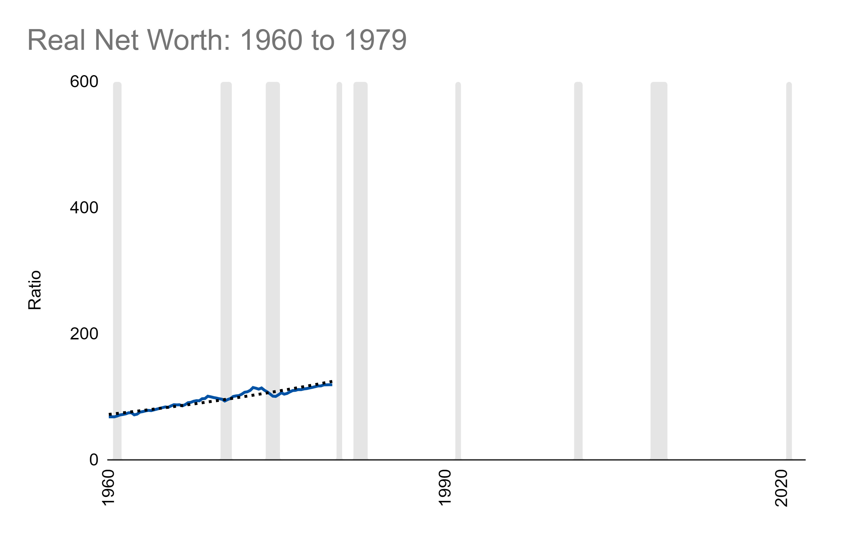
If we imagine the pace of growth for these three exponential fits and start them at the same point in 1960, we get three different projections:

These three projections reflect three underlying models we can consider for how real wealth is supposed to grow over time - a high, medium, and low, so to speak.
If you are super bullish, you would expect the red line. If you are bearish, the green. Or, if you believe that wealth has grown exactly as it should have grown over the last sixty years (seeing is believing or reality is what it is), you would expect the black line.
I chose red for the bullish case because it represents a scenario in which, when wealth runs above the red line, it may indicate a bit of overvaluation of wealth-building assets (like stocks or home prices) even in the eyes of someone bullish.
Now, you could always choose a more bullish scenario to justify where things are…but the more bullish of an exponential fit you implement the worse the fit to actuals. That is, unless, you believe the “true” fit exists in the future and the trend for actual wealth has been undervalued for the last sixty years and things will get much much better. I’m not saying that is wrong, just saying that it represents another scenario.
Essentially, you can choose whatever lines you want. I, however, have chosen these three because I believe they are based on reality and subsets of reality that are fairly plausible.
Whatever you ultimately choose, you now have a pretty powerful tool! You have guidelines that can help you understand where the market (in this case the collective market of all wealth-generating things) is sitting. If it is running more towards the red, maybe it means you want to be more cautious. If it is running more towards the green, maybe it means you want to be more aggressive buying things like stocks or real estate.
At the end of the day, it is an interpretation. It’s one that I think is reasonable and other people might find reasonable or want to tweak some. No matter the case, it provides a solid basis for a conversation or a debate.
It is also extremely powerful for setting expectations about something even more exciting than the past. The future! We will check that out tomorrow.
Links
Most Popular Posts | All Historical Posts | Main Site | EM100 | EM1000 | Contact