
Diving into the EM100
More expansive metrics
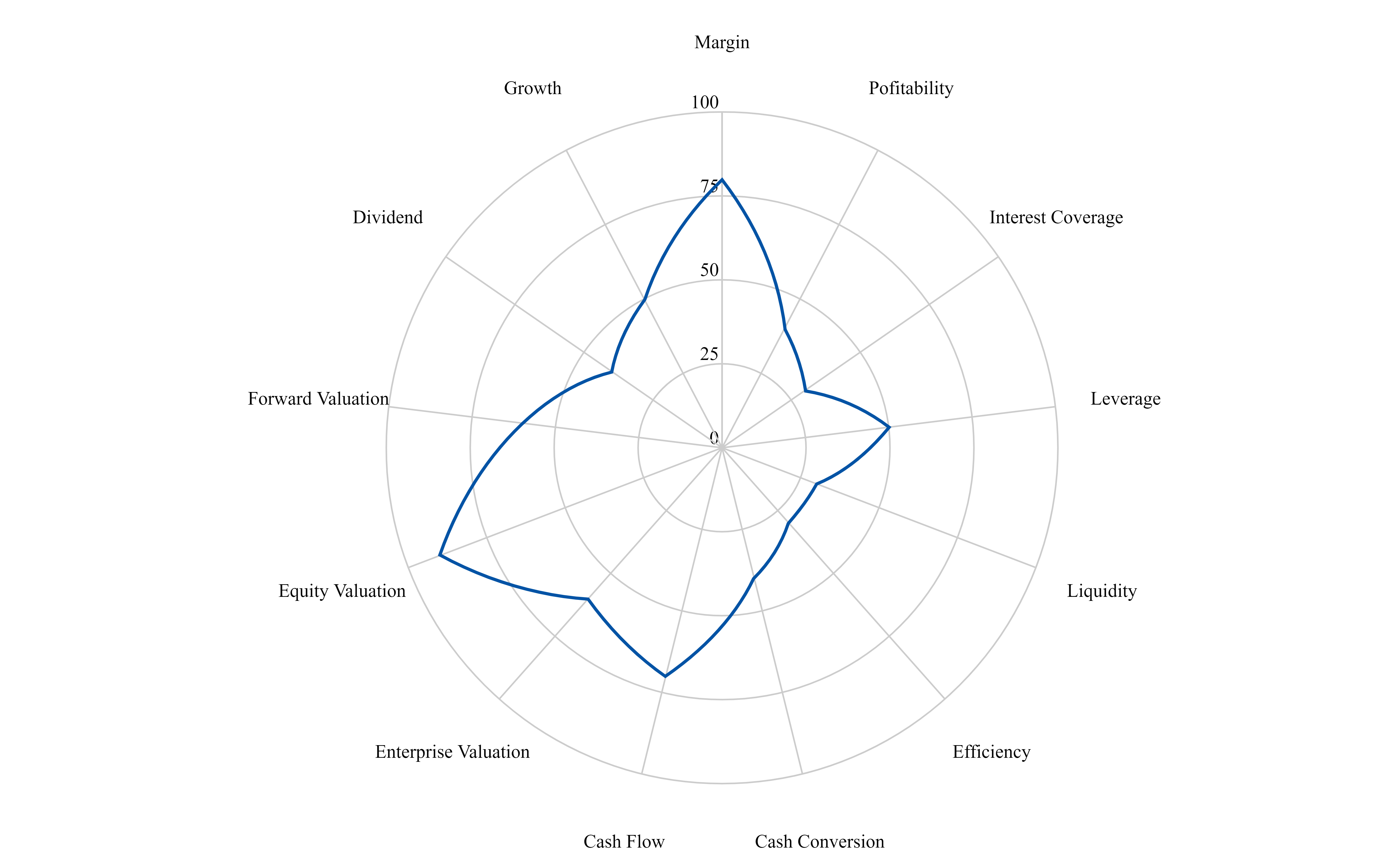
In some recent posts, I talked about expanding the metric universe for stocks to take company analysis to the next level. I showed this picture, which gave an illustration of domain outperformance:
These domains are comprised of 63 underlying metrics, such as the price-to-earnings ratio, which is shown here for the stocks in the EM100:
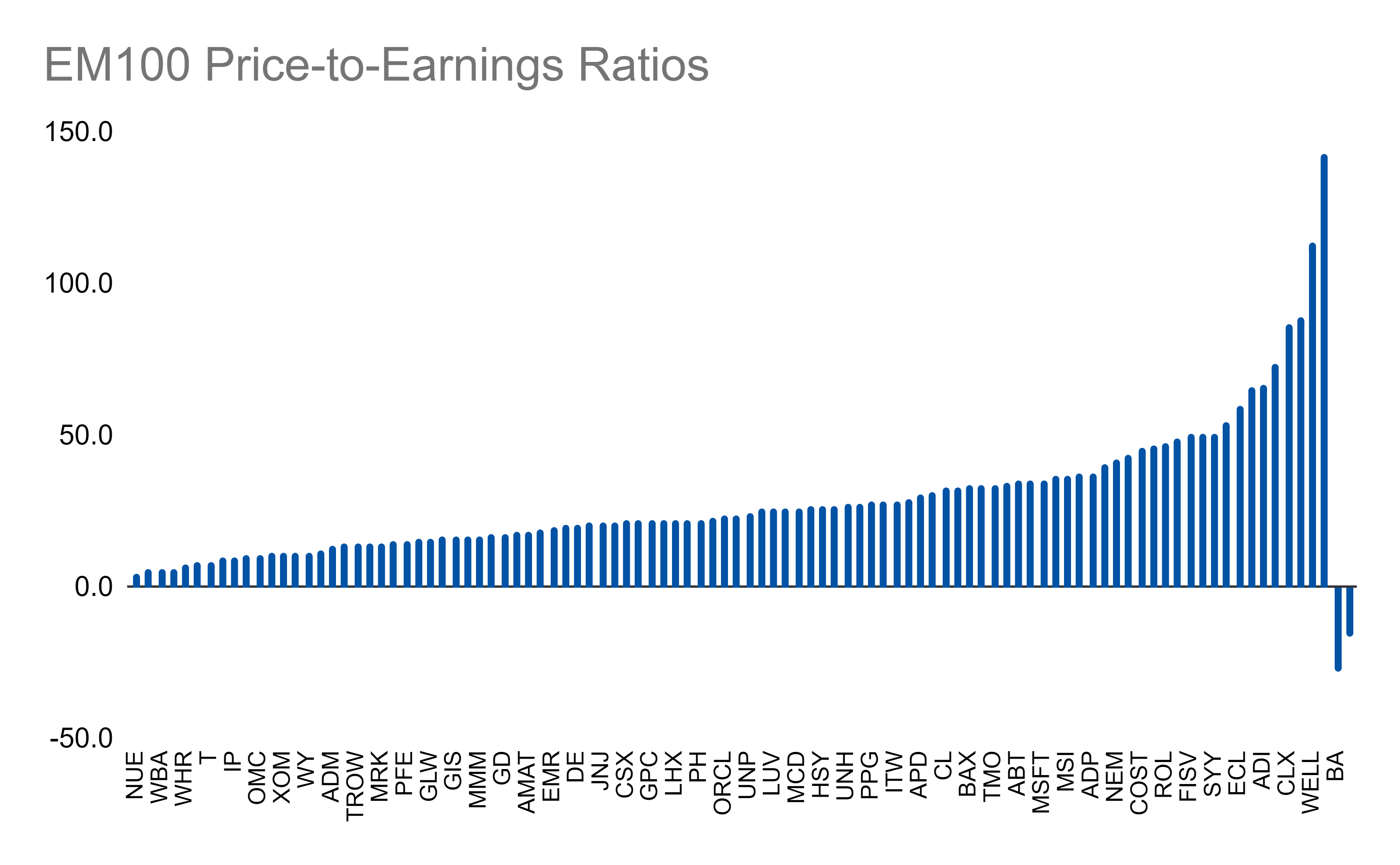
Unfortunately, you can’t see every last ticker here and I tried a bunch of ways to show them but with 100 stocks it was just insanity, so hopefully the cherry-picking of a few stocks to see where they land is still helpful.
As this is just one of the many metrics for analysis, we know we have a lot of data we will need to work with. I’m working to expand it to over 3000 stocks but, in the meantime, working with the EM100 is a good start. It will also allow us to build up some performance flags on the metrics to assess what is good or bad by benchmarking the metrics using these 100 good companies. Anyways, stay tuned for more posts on this!
Good Stuff I’m Reading
Now It Begins, But How Will It End?
“Whether this go-slow approach is the right one is certainly a good question but one that won’t be answered for several months, in which time inflation may continue to get worse. Unlike previous Fed chairs, Powell has made it clear he doesn’t like to surprise the financial markets with any monetary policy changes between meetings, so the Fed has pretty much locked itself into basically not doing anything else for the next six weeks. Is a quarter-point interest rate rise and no reduction in the balance sheet really going to have any measurable effect on inflation in the near term? It’s hard to imagine.”
Day traders take note: ‘Slow’ stock analysts are better at their jobs
“Research from the University of Toronto’s Rotman School of Management shows that, when it comes to stock market analysts, those who are “slow” see their portfolios outperform the “fast” analysts by 5-10%.”
The yield curve might be wrong
“An inverted yield curve doesn't do much to the economy, but it's a very bad sign. While the lead times vary and can be long, the typical pattern is that the 2s/10s yield curve inverts, the S&P 500 tops sometime after the curve inverts and the US economy goes into recession six to seven months after the S&P 500 peaks . Even if the 10/2 inverts, might we be able to dodge the recessionary bullet? Ethan Harris, of the Bank of America economics team, argues that we can. He thinks what the yield curve is telling us has changed over the years...”
Have a question you want to ask or a topic you’d like to see covered? Let me know!
Links
Most Popular Posts | All Historical Posts | Main Site | EM100 | EM1000