
Household Credit Risk
Metrics and Indicators
At the beginning of the month, I said that I didn’t have any special plans or new things I was planning to release for October. Turns out, I thought of something! But, first, let’s walk through the ideas behind it. To do that, we will look at some key consumer metrics.
Since consumers are the primary driver of the American economy, it’s important to have good metrics to evaluate their financial health. One such aspect of that is their credit risk from the perspective of their debt burden.
Now, a lot of scary headlines will talk about debt hitting new peaks or all-time highs, whether that is Federal debt, corporate debt, consumer debt, mortgage debt, and so on. But, nominal values only tell us so much, as those tend to increase over time anyways, so new records are to be expected.
Thus, we want to compare those kinds of metrics to other relevant metrics to better understand what is happening. For example, if household debt is at an all-time high but households have more assets and net worth than ever before, then debt might be high nominally but low relative to wealth and actually in a healthy place. A headline that talks about record debt levels would not actually be something to be as concerned about.
Household debt can be broken into two main components - consumer debt and mortgage debt. An easy example of consumer debt would be credit card balances. And mortgage debt would be the debt people take on to buy homes to live in. There are many ways to look at this debt and three will be considered here for each.
Starting off with consumer debt we have nominal debt levels versus income:
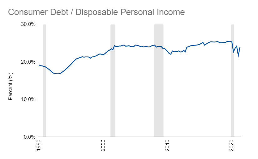
The idea here is debt should stay within a reasonable range of income.
Next is the growth of that debt versus the growth of the economy:
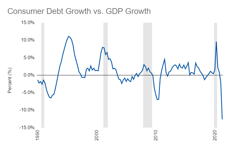
With this metric, if debt is growing faster than the economy, then that is not good.
Finally, we have the actual debt payments being made:
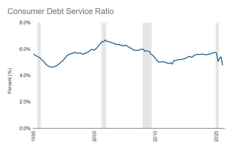
If the regular debt payment burden is low, then households can hold relatively higher levels of debt more comfortably.
Next, we can look at those same three metrics from the perspective of mortgage debt:
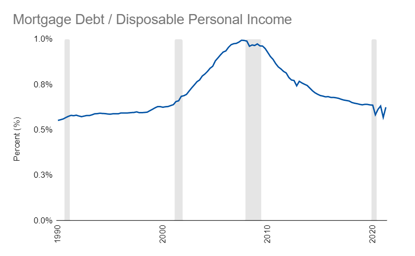
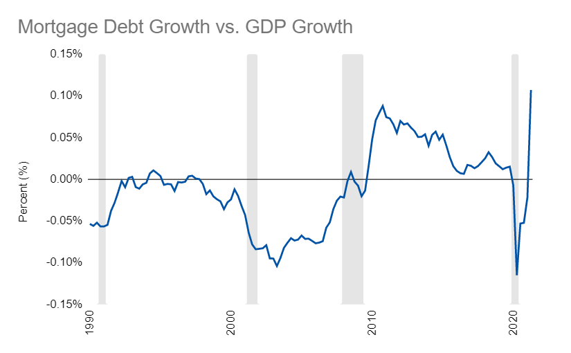
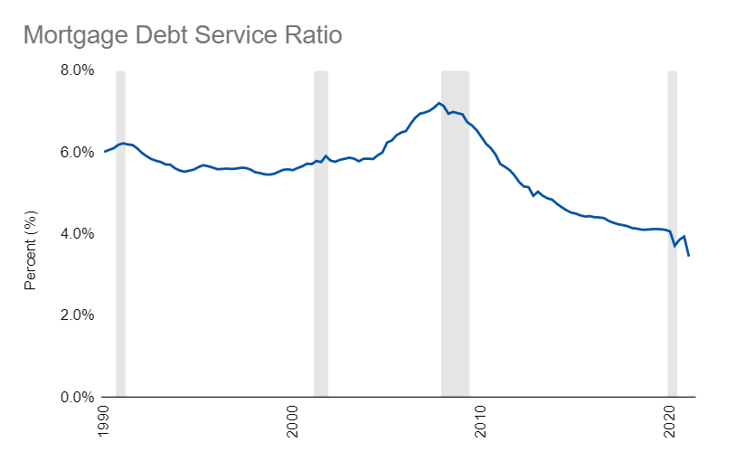
In total we have six helpful metrics to evaluate household credit risk. Now, let’s look at the new thing I was hinting at in the beginning of this article:
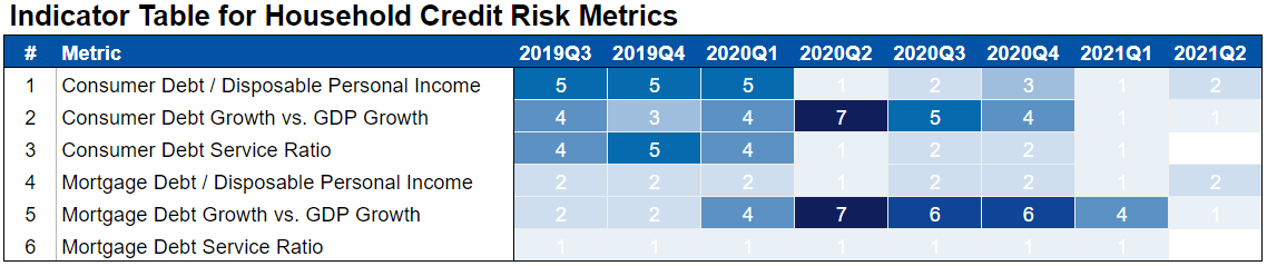
This is an indicator table for the six metrics we just looked at. The idea here is, take each metric and distill it into a simple score from one through seven, with seven being the worst. That way, we can quickly summarize a lot of information in an easy-to-read format.
For example, looking at the last two years, we see that a lot of these metrics have improved following the COVID shock. Even debt growth versus GDP, which was in a bad spot since the economy took such a hit, is now recovering and looking better.
Also, the stimulus in the economy really helped household credit because it increased personal income and thus reduced the risk for metrics one, three, four, and six.
At a glance, we see the story we have been hearing about for a while. In aggregate households are in strong shape and, as drivers of the economy, should continue to be a source of strength.
This will be just the first of many indicator tables that I hope to make. Hopefully, you find the format useful and it will be another good way to convey information about a lot of the awesome metrics we’ve been looking at.
Links
Most Popular Posts | All Historical Posts | Main Site | EM100 | EM1000 | Contact