Housing / Population
It's getting up there
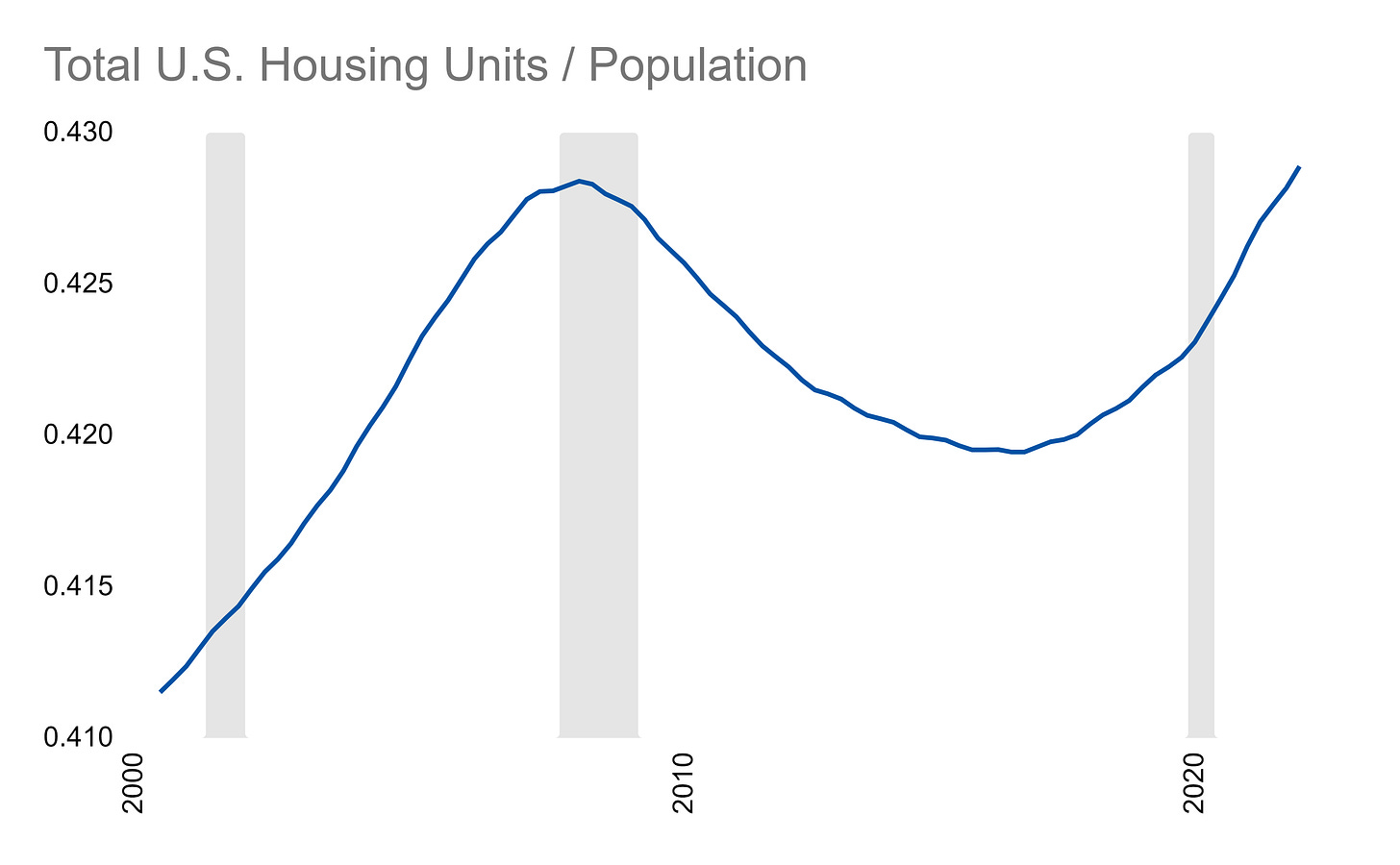
Here’s a ratio I saw someone post about the other day. To make it, you take the total number of houses in the U.S. and divide it by total population:
This is one of those ratios that looks a little spooky because it went through a boom and bust during the 2008 housing crash. Now, it’s back up to that previously problematic level.
The idea here is that there is some proper ratio of homes versus how many people there are. At a level of 0.425, this implies about 2.35 people for every home.
Now, some people have multiple homes, some have no home, some families are small, some families are big, some people live alone, and some homes have many non-family members in them - so ultimately this is a high level metric that gets very complex when you dig beneath the surface.
However, if you zoom out, it’s shockingly stable:
When you change the axis, you wonder if that little bump up and decrease even means anything at all! In this view, it looks pretty flat. Homes and population should be relatively slow moving metrics so this also isn’t a shock.
Ultimately, the signal is up to you to decode - does the slight variation really mean something about the state of the housing market?


I *suspect* that one reason for the housing bubble is that there's now a lot more "real estate investors" owning 2+ properties. There was a similar buildup of investors in 2000-2007, but a lot of them went bankrupt due to poorly vetted mortgages. The current generation of investors won't go bankrupt as easily and thus the bubble could persist for much longer.
Do you have data prior to 2000?