
Market Metrics by Sector
Firm representation, market cap, revenue, income, assets
Today is a very exciting newsletter because for the first time in a long time I can show off a new chart type - the doughnut chart (which despite the name is just a fancier version of the often ridiculed pie chart).
With the EM1000, we can assess the state of the market in a lot of different and important ways that will ultimately help us with stock analysis. So, let’s start by analyzing those stocks by sector affiliation:
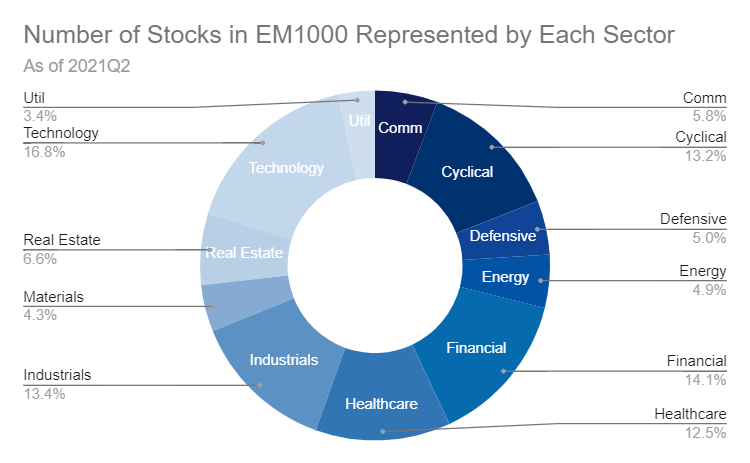
We’ve got a really nice spread of sector representation in terms of numbers. It’s not an even breakout but the same goes for other indices like the S&P 500. Our economy is dynamic and so, for example, we are going to expect more new technology firms than old utility companies.
But the number of stocks is just the beginning, we can also look at market cap:
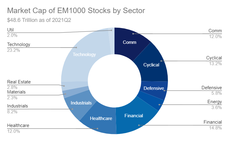
Here we see the domination of tech, with financials, cyclicals, communication, and healthcare coming in right after.
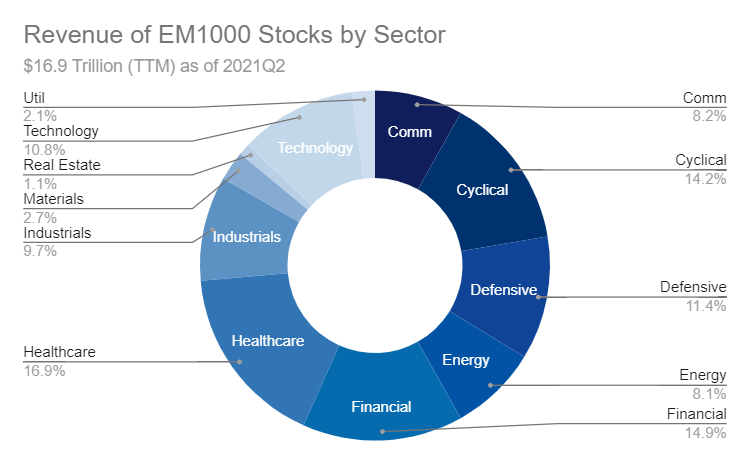
Revenue shows a little more balance:
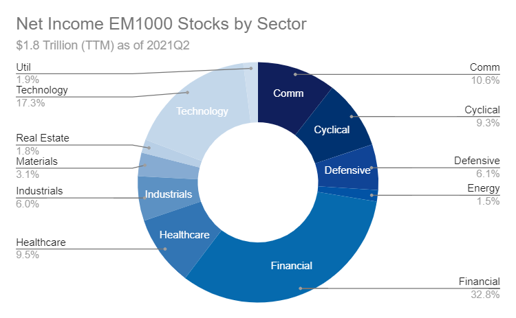
And net income is skewed heavily toward our finance friends and tech buddies:
And assets show the domination of finance firms, as they have a totally different business model than other companies (loans are assets and they make a lot of loans):
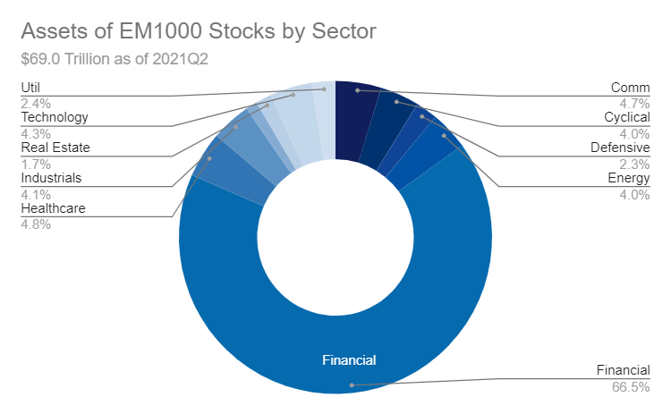
What this all means is that when we talk about the market, we should remember that the market is just an aggregate of participating firms. And, firms can behave very differently.
One such difference can be driven by sector, so we want to understand how sectors work to better judge a company versus an appropriate cohort rather than just against the market as a whole. We will check out more of that in the next post!
Links
Most Popular Posts | All Historical Posts | Main Site | EM100 | EM1000 | Contact