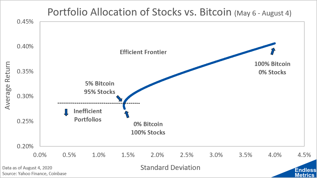
Here’s another way to look at portfolio allocation. Instead of combining return and risk into one return-to-risk ratio, you can use a scatter plot with standard deviation and return as the axes:

The key insight from this chart is that there are several portfolios that have the same amount of standard deviation but different returns. What this means is that any portfolio that holds less than 5% bitcoin is inefficient because there are portfolios with the same risk but more return. By not holding bitcoin over this time period you are missing out!
Above this cutoff of inefficient portfolios is what is called the efficient frontier. These are the optimal portfolios for a given return and risk profile. So, if you were advising someone who said they needed a specific return or wanted to take on a specific amount of risk, you could just find that level on either axis and then look for the efficient frontier to get the right allocation.
This is a pretty powerful and insightful tool but it gets even more interesting as the number of investments expands. There is more to life than stocks and bitcoin and this approach works for any basket of potential investments. What you get in that case is a bigger spread of risk and return combinations that isn’t confined to a single line but is still bounded by an efficient frontier. We’ll look at that analysis later on!
