Real GDP versus Nominal GDP
What's real anyways?
The very first chart on Endless Metrics showed Gross Domestic Product (“GDP”). But, it turns out there are two very different types of GDP. Which, is kind of weird when you think about it. If an economist says that the economic pie is “this” big and also “THIS” big and you ask “well which size is it?” and they just smile and confidently say “well, it’s both sizes at once!” then it would be prudent to question that individuals sanity. So, let’s take a look at what all that means with a chart:

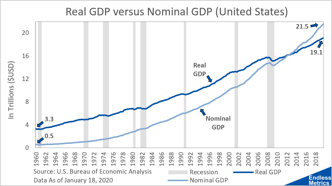
The darker line is the exact same line that was shown in the first post of this newsletter. That’s real GDP. The new, lighter line is nominal GDP. There are a few things to point out here:
Real GDP starts out higher than nominal GDP ($3.3 Billion) but ends lower ($19.1 Billion)
Nominal GDP starts out lower than real GDP ($0.5 Billion) but ends higher ($21.5 Billion)
Because it starts lower and ends higher, nominal GDP has to have a faster growth rate than real GDP.
So, real GDP and nominal GDP are two similar looking and related lines but there is some difference between the two in terms of growth rate. Basically speaking here, nominal GDP = real GDP + something. That something is inflation, which is the key to how the economic pie can be two different sizes at once and why economists are okay with that.
Now, take a closer look at the dark line in the chart, it’s actually fairly linear. Whereas the lighter line for nominal GDP has much more of a curve (i.e. polynomial or exponential instead of linear). That is because of the compounding growth rate of inflation.
The reason why there are even two types of GDP in the first place is because, in essence, if you want to track the growth of the economy, you want to cancel out any effects of changing prices. Raising the cost of a good without changing the good would make nominal GDP larger and imply growth but really that is just inflation of prices. The good stayed the same so there wasn’t “real” growth. Real GDP strips away the price difference from inflation so that economists can directly compare different years and say how much the economy really grew.
Looking at nominal GDP, one would say that, since the economy went from 0.5 to 21.5, the economy is now about forty times bigger than it was in 1960! That would be great for the country but, unfortunately, in real terms (stripping out the impact of the increase in prices, aka inflation) it only went from 3.3 to 19.1, which is almost six times bigger. That’s a nice growth rate and pretty insane progress when you think about it but definitely not as much growth as forty times.
At the end of the day, true growth is important to measure and inflation is also a serious thing to keep in check. Separating those two related but different influences and examining them as individual parts that make up nominal GDP gives economists more ways to look at the world and assess what is really going on. Knowledge is power and having two “different” sizes for the economy is helpful.
Which size is it really though? Well, it depends on what question you are trying to answer. It’s important to keep both nominal and real tools in the toolkit depending on the job at hand. For the next post, we can look into inflation a little bit more to understand this driving differentiator of nominal and real GDP.
Related content:
What’s Next for Endless Metrics
