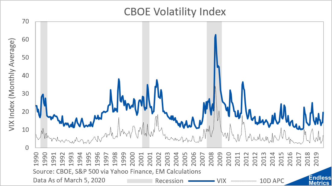
Yesterday, I wrote about how the market sometimes has rogue periods of increased volatile movement. I measured the amount of movement with a rolling ten day cumulative sum of the absolute daily percentage change. Turns out, there is a more official way to measure volatility and it looks like this:

This is the volatility index (“VIX”) which is published by the CBOE. It’s really popular and basically every time someone writes about it they have to refer to it as the “fear” index. I think that’s some of the best time series marketing since “golden cross” and “death cross” so it makes sense financial writers get excited to call it that.
The VIX is fairly complicated to calculate and I won’t go into details here as they are covered better elsewhere. Along with the VIX, I have yesterday’s 10-Day Absolute Percentage Change (“10D APC”) metric (scaled down a bit lower for visibility) as a dotted line below the VIX. Obviously, the calculation I made for the 10D APC was really basic but what is shocking how similar it is to the much more complicated calculation of the VIX. Those two time series are 93% correlated! It just goes to show that sometimes a very simple tool can also get the job done.
Ultimately, both metrics are indicators of volatility, which is important to track as it typically indicates some level of stress on the market. Sometimes, like in the case of the Financial Crisis in 2008, there is a very clear correlation between that volatility and the economic conditions of a recession. Other times, markets just have a spurt of volatility. So, next time markets seem a little crazy, check the VIX. After all, it is the “fear” index. Spooky stuff.


