
Unemployment by State
50 problems
Here’s a nice looking graphic that depicts a really awful situation:
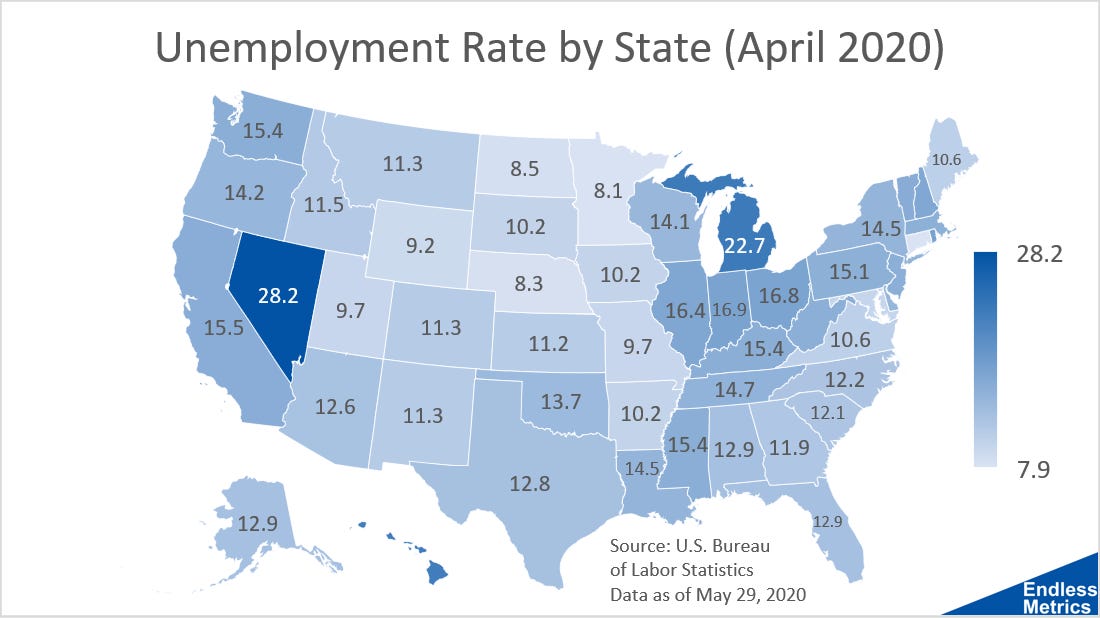
One thing to always keep in mind with almost anything to do with numbers is that they are an abstraction of reality. This is especially true of averages, which is how the unemployment rate is usually discussed - as a national statistic. While that metric is important, the underlying reality is much more nuanced.
The United States is incredibly diverse and so is its labor market. It would make sense then that even though the national unemployment rate for April is 14.7%, there is a larger range of rates for each state individually.
Take a look at Nevada and Michigan. Not good. Now, compare that to Minnesota and Nebraska. Not as bad. (And, if you are like me and can’t remember which state is which then just look at the numbers.)
Even though a common phrase for COVID-19 is that viruses don’t discriminate, a negative economic event doesn’t have to discriminate to have a wide range of impacts across the country. It doesn’t take long to list a few reasons why Texas isn’t California or New York isn’t Nevada. And those differences mean that they can react differently to similar events.
So, let this be a lesson on the benefit of granularity. It’s relatively easy to get a lot of cool information and insights when breaking data into smaller components. The hard part, in most cases, is getting that information. But it’s totally worth the effort when it makes a cool visualization!