
Value and Growth
Checking in on the style wars
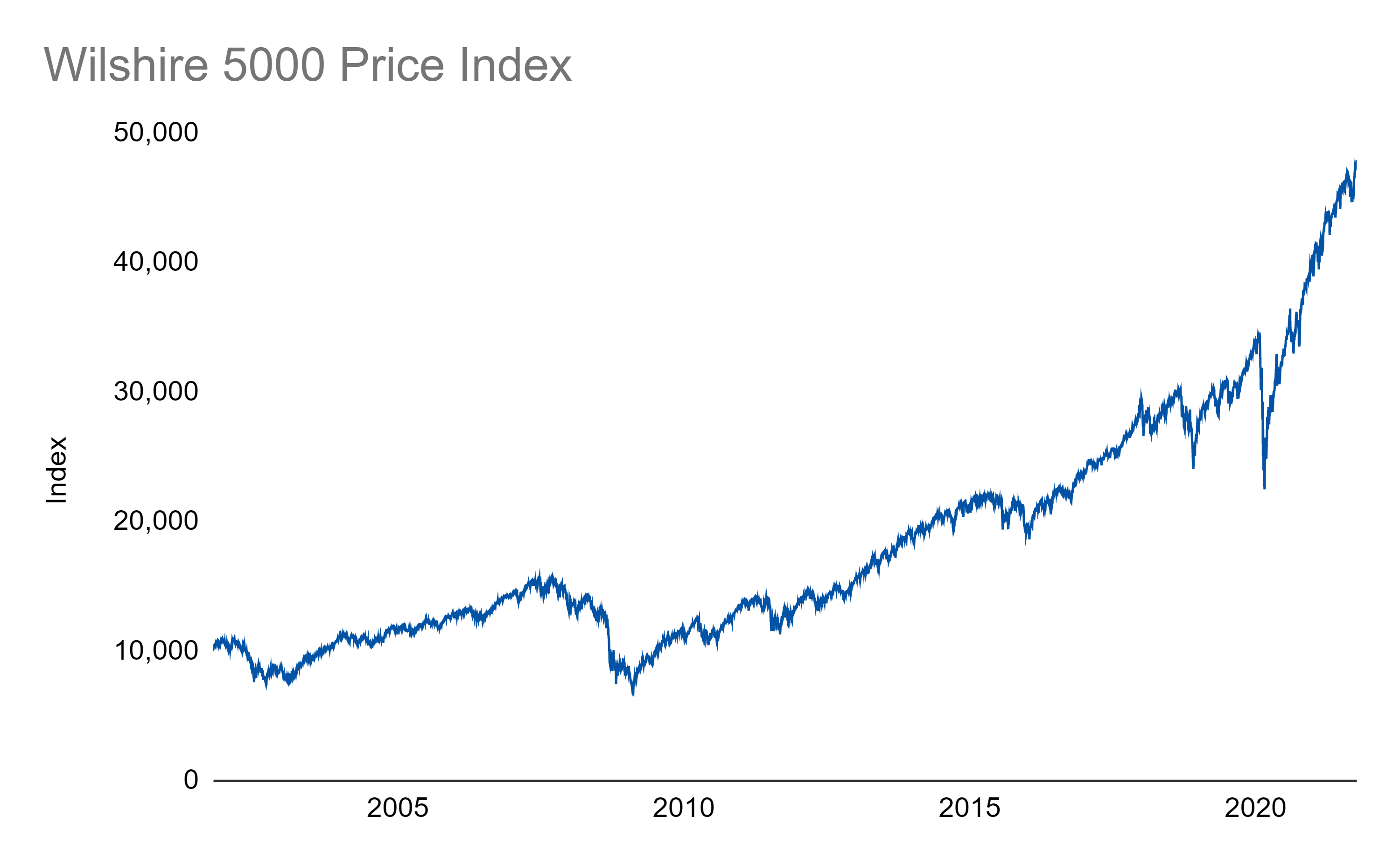
Let’s start with twenty years of stock market history with a very broad index, the Wilshire 5000:
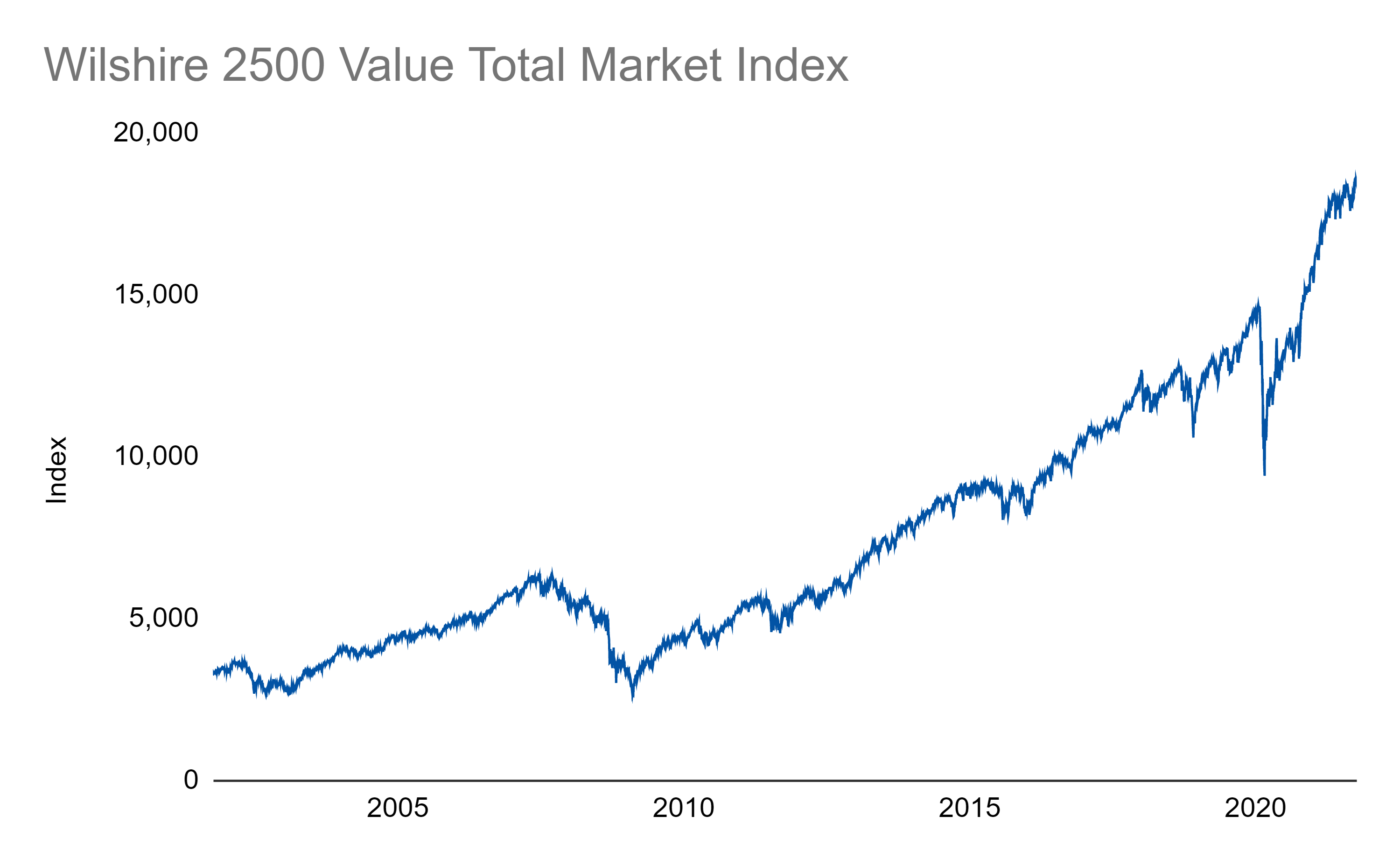
We can take a subset of that index for stocks that are more of the value variety:
And stocks that are more of the growth variety:
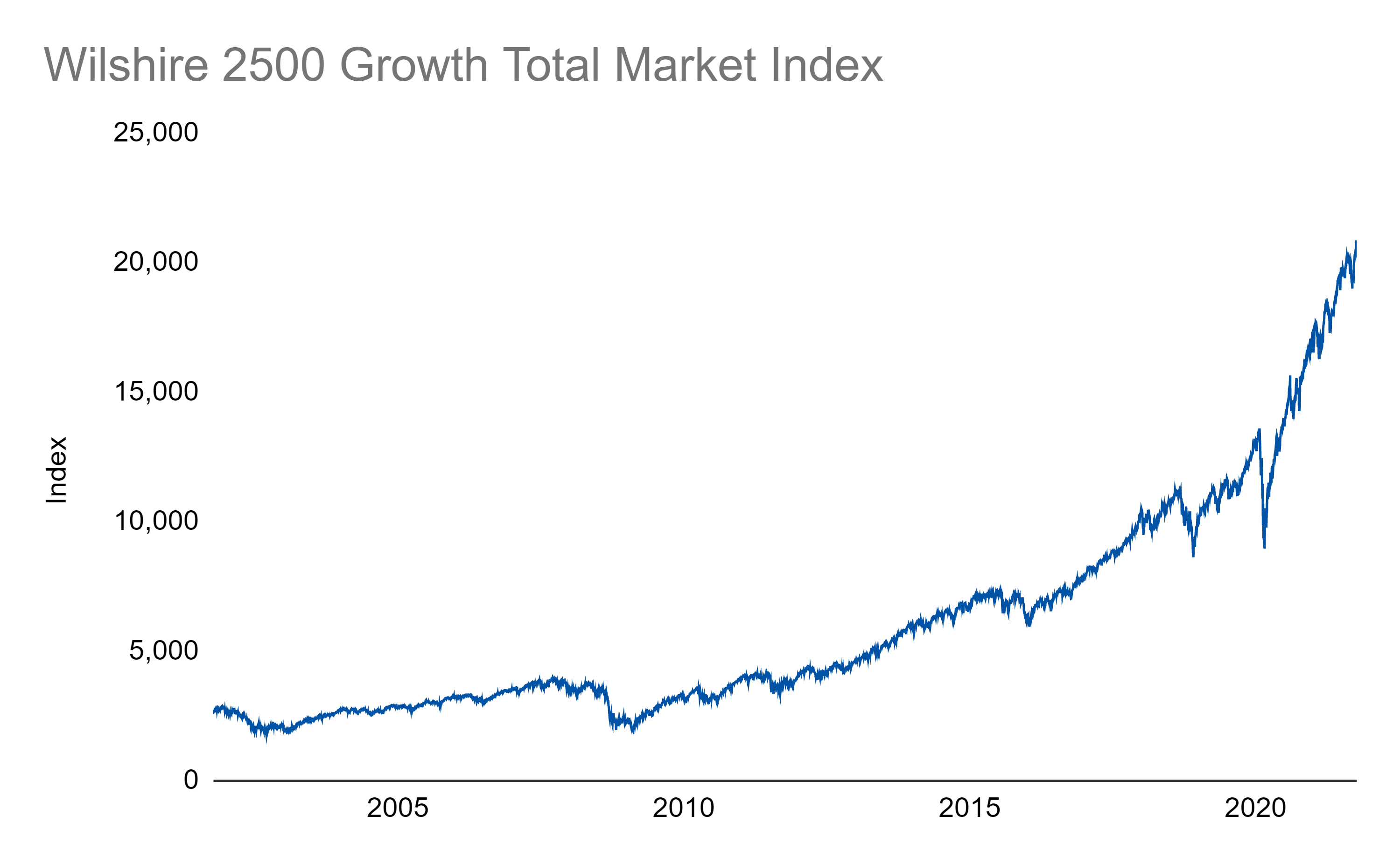
Eyeballing those two charts, it’s clear that growth has outperformed value, especially recently. One way we can better compare that performance is to use a ratio of the growth index versus the overall index:
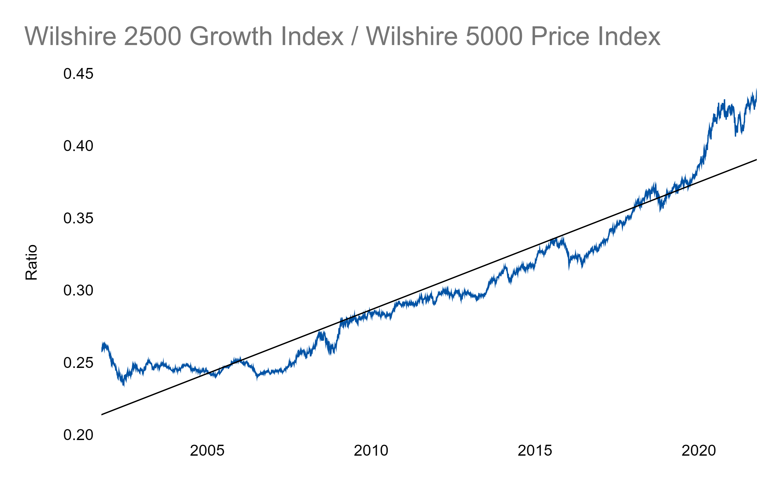
Using the underlying black trendline as our guide, we see that growth has been running well above trend and outperforming since the beginning of the pandemic.
Value, using the same methodology, has been running significantly behind:
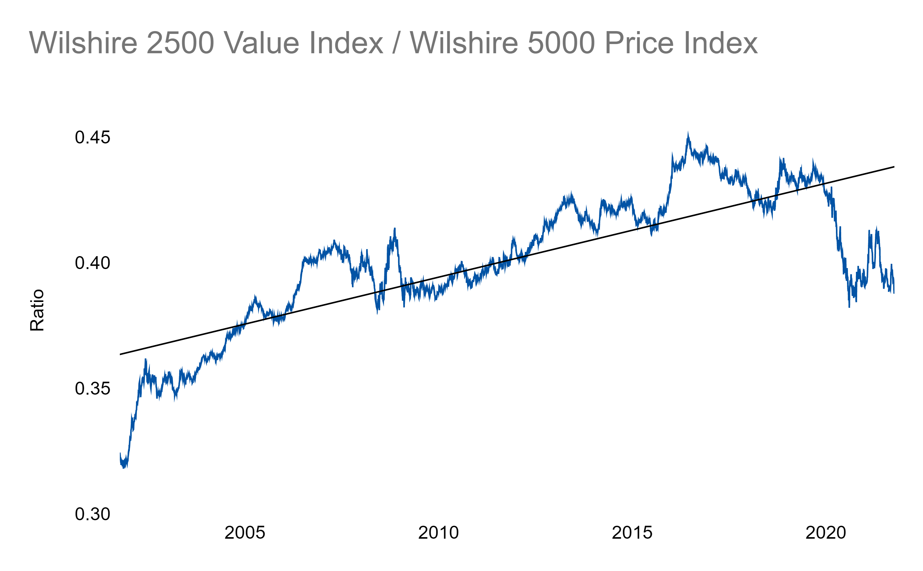
This underperformance (implying undervaluation) is one driver of recent recommendations out there to pick up some more value exposure, though those calls haven’t been as loud lately as the recent rebound was extremely short lived.
My opinion here is to use charts like these as a guide along with many other factors when making investment decisions as opposed to a single rule for a yes/no. Most of the time, the more information the better!
Links
Most Popular Posts | All Historical Posts | Main Site | EM100 | EM1000 | Contact