
Wealth Inequality
Things ain't always even
Wealth inequality is one of those terms that dredges up a variety of strong feelings from people. One thing about it that can’t really be argued is its existence. After all, there has never been a point in history where everyone had the exact same amount of wealth. Even if we started over from scratch and gave everyone on Earth a dollar, someone would eventually have to temporarily spend it in some transaction with a minute degree of value asymmetry.
Since it exists, people may then argue whether things are too unequal or maybe just fine as is or should be even more unequal, which may sound a little silly but is actually inherent in any monetary or fiscal policy decision basically by definition.
So, things are unequal and they may be too unequal or not unequal enough (people elsewhere can debate that) and we know that inequality is influenced by monetary and fiscal policy choices (amongst many other types of choices) at a micro and macro level. We know that economic frameworks and markets change over time and, therefore, again, by definition, the degree of ever-present inequality must change over time.
Measurements of inequality produced by the Federal Reserve indicate that inequality has gone up over the last thirty years. But, just saying something has gone up isn’t really a lot of information. One degree warmer in temperature may or may not matter most of the time but, in some circumstances, like ice melting to water, it could mean a lot.
To better understand wealth inequality, what it might mean, how it occurs, why it might get exacerbated (or not), we can look to data. A great place to begin is by taking a breakdown of previously discussed wealth components, starting with equities:

There are four typical buckets used for measuring wealth inequality - the top 1%, the next 9%, the next 40%, and the bottom 50%. If you haven’t noticed already, these buckets by themselves are already terribly unequal! So, when you look at these charts it’s kind of like inequality on top of inequality. When it comes to the stock market, the 1%, on average, own a lot of stock.
The 1% also own a lot of real estate but more of that total wealth is owned by the next 90%-99% and 50-90%. The thing about stocks is you don’t need stocks to live but you certainly need a roof over your head. And, there are a lot of people who need a place to live:
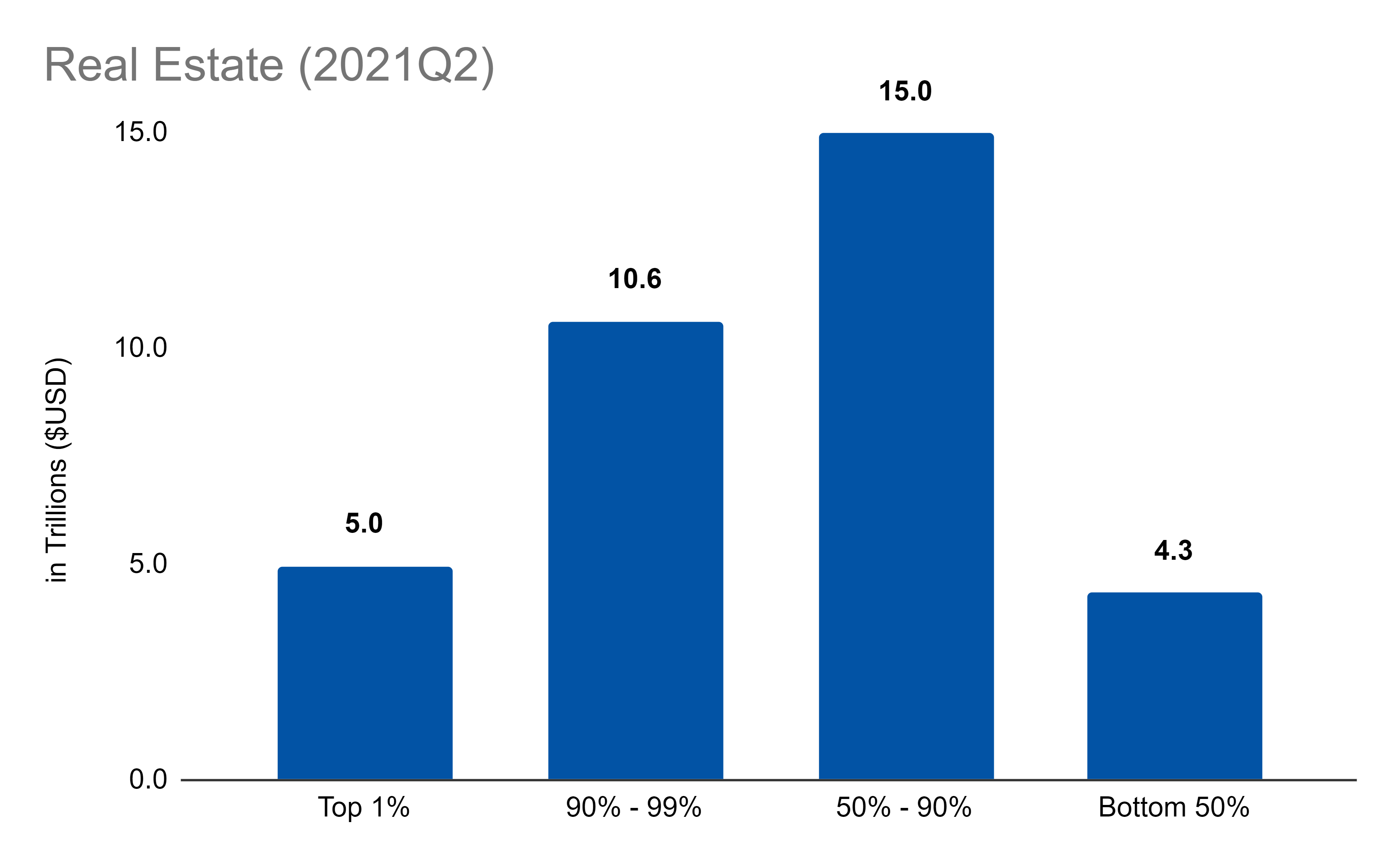
Another aspect about real estate, however, is that you don’t need to own a place to live there. You could just rent. That’s one reason why wealth for the bottom 50% is so low. The bottom 50% don’t have much in the way of stocks or real estate.
Next up is pension entitlements:

These are also dominated by the middle 49%, as people in this range make decent salaries and collect entitlements on top. There aren’t a lot of people in the 1% to collect enough of these entitlements and the bottom 50% don’t even make enough to be offered much in the way of entitlements.
Next is noncorporate equity, which looks in chart-form like regular equity:

Finally, we have deposits and other short-term investments:

With just these five wealth components, we now understand over 80% of all assets and how they are owned by various buckets of wealthy people. This is a super important first step toward answering questions about wealth inequality because if we understand what makes people wealthy we can understand what will happen to those things under various scenarios (like a stock market crash, or accelerated inflation).
More of that coming soon!
Links
Most Popular Posts | All Historical Posts | Main Site | EM100 | EM1000 | Contact