Let’s consider ten large companies by market capitalization:
While this list is missing some obvious other big companies, what’s nice about these ten is that they have at least a thirty-year history of fundamental data (versus another big company like Facebook which had its IPO about ten years ago).
These ten were ordered on the list based on their current market capitalization, which isn’t too different than their market capitalization at year end. If we visualize the data, most of the change since year end doesn’t even matter because what really matters is that two of these companies are much bigger than the rest:
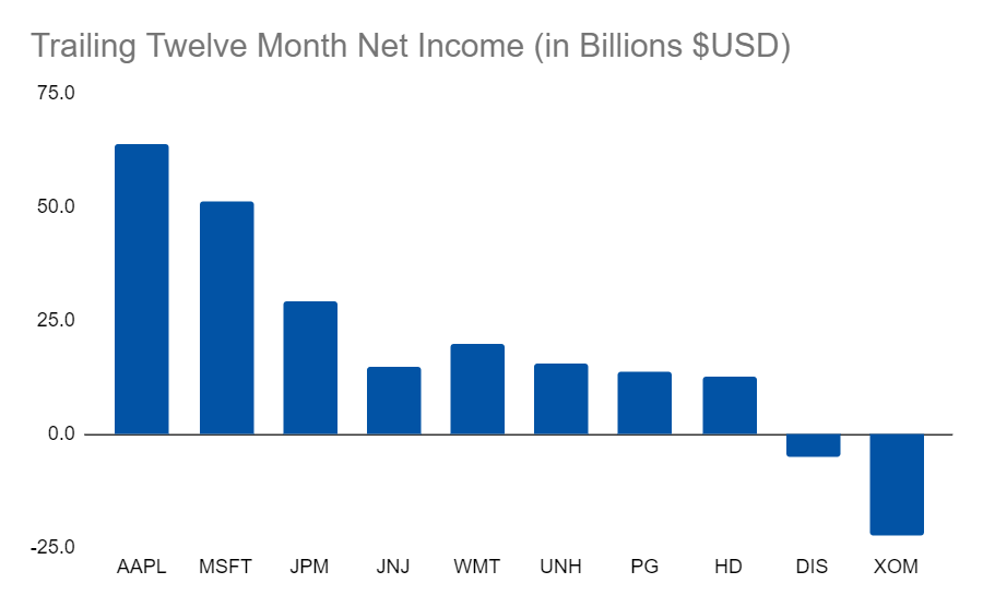
Net income, however, doesn’t look nearly as skewed:
This makes it that much more surprising then to realize that the PE ratios don’t look all that different either (at least at this scale):
You might think that Apple and Microsoft have an outlandish PE given their size but (while high) it’s not nearly as high as some other well-known companies. JPMorgan stood out with a nice low ratio and they have done really well this year so far.
Disney looked the “worst” with a big negative PE but remember that this is a ratio, so a big negative ratio means a small loss. Thus, the worst PE ratio actually belongs to Exxon. (This confusing result is one reason negative PE ratios aren’t usually shown).
Anyways, this is just a point in time. While interesting, these ten companies can tell an even deeper story through their history. So, we’ll be taking a look at some long-term time series for the PE ratio using these ten companies in the next post!
Links
Yesterday’s Post | Most Popular Posts | All Historical Posts | Main Site | Contact


