
Now that we’ve seen the return and risk for the six simple investment categories, let’s try to find a way to do better.
We know that calculating all the portfolio options is going to require 96 million variations and, honestly, that seems like an annoying time commitment to figure out. So, let’s just play dumb and consider seven easy portfolios that have various allocations of the six original investments.
First, let’s do a naive, equal-weighted portfolio where we just split our allocation evenly among the six investments. Next, let’s look at portfolios where we heavily weight one investment by doing 50% into one investment and 10% in the five others (e.g. stock heavy with 50% in VTI, 10% in the five other investments or cash heavy with 50% in cash, 10% in the others and so on).
Here’s how those seven new portfolios stack up against the original six stand-alone investment categories:
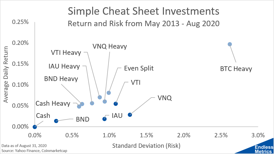
Now, I don’t show Bitcoin by itself on this chart to the make the scale more readable but we know it’s way out there in terms of risk/return. For anyone who has 100% of their portfolio in Bitcoin, I applaud your nerves of steel. That’s not an allocation I’d recommend to the average investor.
Besides the Bitcoin-heavy portfolio, we see our simple allocation portfolios are all clustered relatively close together. That was the first thing that really surprised me. I honestly didn’t expect to see portfolios with such heavy concentrations to end up looking so similar, especially for a portfolio that holds 50% cash!
In terms of performance, all of these portfolios dominate the single investment portfolios because they are higher up and further to the left on the scatter plot, indicating a better proximity to the efficient frontier. Our even split portfolio looks really good from this perspective.
Maybe, in the grand scheme of things, this is evidence that we really shouldn’t worry so much about how we concentrate our portfolio. Just be dumb, even things out, get broad and different categories, and get on with your life.
Sadly for me, my hobby is writing about this stuff so “moving on” with my life means more time to write and fill up your inbox. So, in the next post, we will take a detour and assess what’s happening here from another analytical angle. After that, we will really start to have fun and look at even more portfolio allocations on this chart. And by more, I mean hundreds of thousands more!