At some point, someone with really good marketing skills took some simple analysis with moving averages and came up with the idea of “golden crosses” and, the much spookier named, “death crosses.”
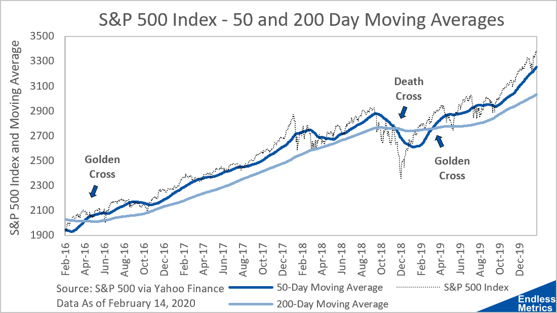
Very generally, the concept is the result of the interaction between a longer moving average and a shorter moving average. Typically, people will use 200 days and 50 days for the long and short periods. I don’t really know why. Tradition maybe? Anyways, it looks like this:

With a shorter window on a moving average, like 50 days (the dark blue line), you get a smoothed index average but a good bit of movement still. Compare that to the lighter blue line which is the boring and calm 200 day moving average. The underlying index (the choppy black dotted line) dictates the behavior of both but the choice of days determines the amount of smoothing.
A golden cross happens when the 50 day moving average crosses the 200 day moving average from below. People like this because it’s an indication of market momentum to the upside since the gains in the short term are outpacing the gains in the longer term.
A death cross happens in the opposite way. The 50 day moving average crosses the 200 day moving average from above. This is a bad indicator for momentum because short term gains are less than long term gains.
These crosses don’t happen very often. Since 1928, there have only been 47 instances of each. (At first, I was surprised that they had each occurred exactly 47 times but then I realized I am an idiot because they are both concepts based on averages and so that’s exactly what someone should expect!) Dividing the number of crosses by the total number of years suggests we ought to see a cross about once a year, with the last cross seen in early 2019.
In terms of the performance of golden crosses and death crosses, using a forward 200 day index change, the results are on average what you would expect. When there is a golden cross, the index rises on average 10% over the next 200 days. With a death cross, the market still goes up but only 3.9%. That is actually less than the average of 5.8%. So, there is something to this simple moving average calculation then! Kind of weird, honestly. It shows that momentum is a real market factor and worth paying attention to as a metric.
That makes two more indicators to add to our metric inventory! It’s also been a little less than a year since the last cross, so maybe at some point soon we will get to see one again. Though, maybe we don’t want to given the next cross will be a death cross!
Related content:
Valuation With Moving Averages?
What does overvalued even mean?
S&P 500 / Gross Domestic Product for the World
Gross Domestic Product for the World
S&P 500 / Gross Domestic Product


