


Let’s start with the S&P 500, which might be the most watched index out there:
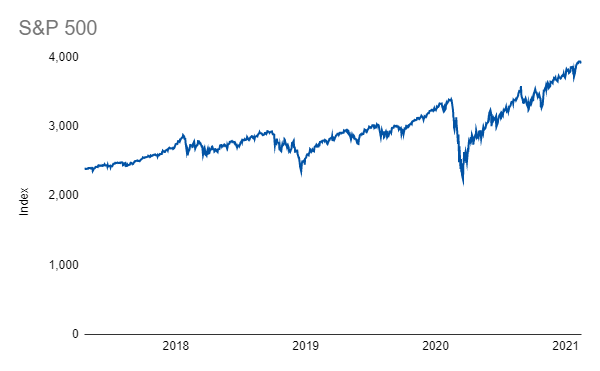
It’s clear that there is a good amount of volatility in the time series but, in general, new all-time highs appear to happen fairly regularly. That is, unless you look at the Rolling All-Time High and see that there can actually be long stretches without new records:

Taking the first chart and dividing it by the rolling all-time high gives a good look at the magnitude of drawdowns in the S&P 500 off those all-time highs:

I love this chart because it shows the downside of the recent market drawdowns so clearly. It also shows how much faster and deeper the COVID crash was than the prior two drawdowns. Whenever the next pullback comes around, I’ll be sure to post this metric so we can see how it compares to these three!
Links
Yesterday’s Post | Most Popular Posts | All Historical Posts | Contact
Portfolios
Main Portfolio | Wild Stuff | Shiny Stuff | Safe Stuff | Big Stuff | Random Stuff
Live Charts
Tracking Portfolio Performance | “Wild Stuff” Constituents | “Shiny Stuff” Constituents | “Safe Stuff” Constituents | Ten-Year Treasury Less Two-Year Treasury | Ten-Year Breakeven Inflation Rate | S&P 500 | S&P Rolling All-Time High | S&P 500 Drawdown | Three-Month USD LIBOR | Three-Month Treasury Bill (Secondary Rate) | TED Spread