If you find yourself bored with the usual old S&P 500 chart…
Then try the S&P Moving Averages chart to add some extra metric flavor!
Moving averages are more than just smoothed lines. When we compare them to the underlying index we can get a quick sense for how much the index is currently deviating from the longer-run, more stable trend. Here’s the S&P 500 / 200-Day Moving Average for example:
And here is that comparison using the shorter-run S&P 500 / 50-Day Moving Average:
Finally, we can compare the S&P 500 50-Day Moving Average / 200-Day Moving Average and get a lagging (but still helpful) indicator for Golden Crosses (and Death Crosses!):
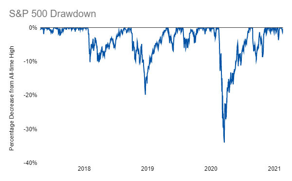
Compare that chart to the S&P 500 Drawdown and you’ll see that the moving average ratio tends to give a lagging confirmation for market bottoms. So, if the market hits bottom in the future and you aren’t 100% sure it’s truly the bottom, just wait for the moving average ratio to bottom out as well to give yourself some additional confidence:
So, now we have four helpful new tools for our toolkit and you can check them out anytime in the “Live Charts” footer section below!
Links
Yesterday’s Post | Most Popular Posts | All Historical Posts | Contact
Portfolios
Main Portfolio | Wild Stuff | Shiny Stuff | Safe Stuff | Big Stuff | Random Stuff
Live Charts
Tracking Portfolio Performance | “Wild Stuff” Constituents | “Shiny Stuff” Constituents | “Safe Stuff” Constituents | Ten-Year Treasury Less Two-Year Treasury | Ten-Year Breakeven Inflation Rate | S&P 500 | S&P Rolling All-Time High | S&P 500 Drawdown | S&P 500 Rogue Wave Indicator | S&P Moving Averages | S&P 500 / 200-Day Moving Average | S&P 500 / 50-Day Moving Average | S&P 500 50-Day Moving Average / 200-Day Moving Average | CBOE Volatility Index (VIX) | Three-Month USD LIBOR | Three-Month Treasury Bill (Secondary Rate) | TED Spread | Price of Bitcoin | Bitcoin Rolling All-Time High | Bitcoin Drawdown | Bitcoin Rogue Wave Indicator


