


Seventy Years of Household Assets
All the different things people own
In my last post, I wrote about breaking out financial and non financial assets. I did that with every intention of writing two separate posts covering further details on each. But, after creating a bunch of potential charts, I realized it just wasn’t as interesting as I thought it was going to be.
So, I decided to scrap the two separate post ideas. Instead, I took all the financial and non financial assets and put them together into one chart that covers the most important asset classes:
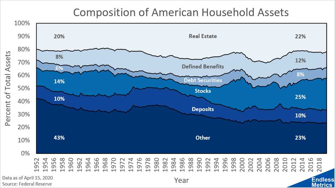
What I like about displaying information this way is it is very clear to see familiar asset classes like stocks and real estate through time. Some assets have been relatively stable and others (especially stocks) have shown more volatility.
It is also helpful to look at this and compare it to one’s own financial situation. Perhaps you own more stocks or have a larger mortgage. Or maybe you keep more money in the bank in deposits and should consider putting that cash into something else.
Most of all, I love the history this chart captures. Think of how much the world has changed since the early 1950s. This is a lifetime of trends in finance and economics all in one quick picture. Pretty amazing how much can fit in one simple chart!