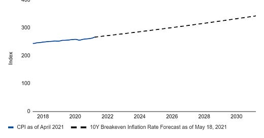
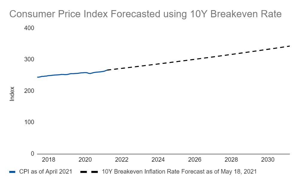
I recently talked about using breakeven inflation expectations to forecast the consumer price index. But, I think the concept looks even better when visualized:
This may not look all that special. After all, it’s pretty much just a line. What makes it cool though, is that it uses daily changes in inflation rates implied by interest rates. That means this line can be updated every weekday when rates change. This gives us a dynamic projection we can assess pretty much in real time, which isn’t bad for something forecasted so far out!
There are a few ways we can make this even better though, which I’ll show off in the next few days. Then, I’ll turn this chart into a live chart hosted on the main Endless Metrics site, so whenever you are curious about inflation you can check it out and see the latest update!
Links
Yesterday’s Post | Most Popular Posts | All Historical Posts | Main Site | Contact


