When we just looked at stocks and bitcoin, we saw that there were some portfolio combinations that didn’t make any sense from a return-to-risk perspective because they weren’t on the efficient frontier.
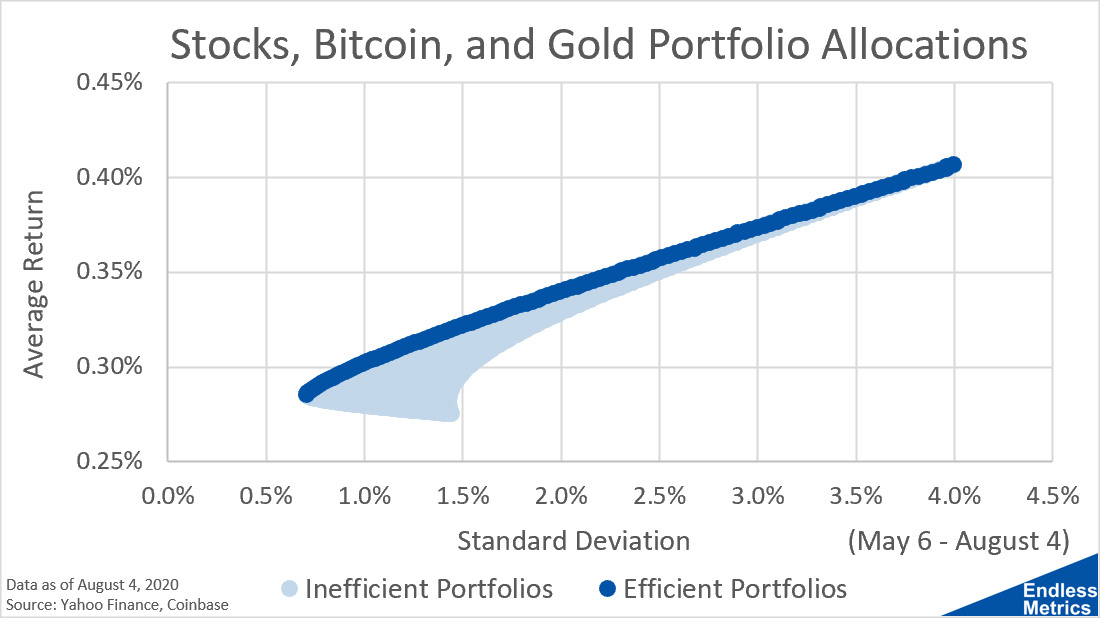
The efficient frontier still exists for portfolios that have more than two investments but the potential allocations of inefficient portfolios becomes much larger. In fact, when visualized on a scatter plot, those inefficient portfolios are no longer constrained to a one-dimensional line but are now on a two-dimensional surface:

This is kind of a funny looking shape. Intuitively though, it isn’t that strange - it shows all the potential combinations of return and risk possible between stocks, bitcoin, and gold.
The reason the line on the edge is highlighted though is because those are the “best” portfolio options for an investor. They represent portfolios with the best return possible for a given amount of risk. For sane and rationale people, they prefer more return to less return if they can get it for the same amount of risk. These are the most return efficient portfolios for any given risk.
The efficient frontier is really about optimizing your choices. People have all sorts of different risk tolerances, so they can pick their desired risk level and then get the optimal portfolio by looking at the efficient frontier.
While it’s a really informative tool, drawing the full population of portfolios that are part of the efficient or inefficient areas gets significantly more difficult as the number of investments increases. We will look at just how computationally challenging that problem quickly becomes in the next post.


