Five Useful Coronavirus Charts
Visualizations of the latest WHO data
On Friday, someone was nice enough to drop me an email that they had seen one of my charts on ZeroHedge.
Unfortunately, it had been brutally edited with a scary red line to capture the rise in cases. What a shame - red just doesn’t fit with my color scheme!
Anyways, I figured if people want to use my charts without asking, the least I can do is update them. So, I’ve got a special five charts this time around to cover, all with the latest data:
1) Infections

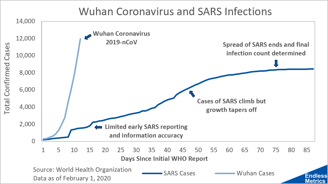
I originally posted this chart in the post “Pandemic? It’s still early…” and, I’ve got to be honest, the change in just a few days is shocking. The number of Wuhan Coronavirus (2019-nCoV) infections has already climbed above the total number of SARS cases, which took SARS months of spreading to do.
2) Growth Rate

An alternative way to look at the chart above is to consider the growth rate. I like this view because it is a little easier to see that the growth rate has actually tapered a bit (especially with the shorter time frame). Unfortunately, becuase the number of cases is now over ten thousand, even a decreasing growth rate still means thousands of new infections a day.
3) Death Rate

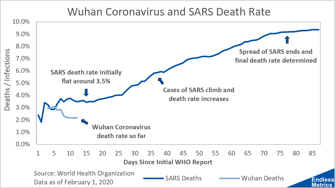
The bad news from the first two charts is that the number of Wuhan infections have far exceeded SARS infections. The good news is that, thus far, the death rate for the Wuhan Coronavirus has been lower than SARS.
That could still change. SARS was not as deadly in the early reports compared to later on. Reason being, the illness was long and did not kill immediately.
Sickness takes time. As the weeks go on, many of those currently infected by the Wuhan Coronavirus may, sadly, not make it. Let’s hope this metric continues to drive lower through improving treatment and care.
4) Exponential Forecast

I put together a very simple forecast a few days ago after the ninth WHO situation report with a forecast based on an exponential function.
As stated in that article, an exponential function is not good for long term forecasting but is okay for just a few days given the general nature of how a virus like this can spread. The first couple days of the forecast, the number of actual cases exceeded the prediction. Fortunately, that has slowed down and the fourteenth report is almost certain to be less than the 19.8 thousand predicted. (Very happy to be wrong here.)
5) Long-term Forecast

The day after I did the simple exponential forecast, I did another simple (but more plausible) forecast based on growth rate deceleration. It’s early, but this one is tracking fairly close to the actual number of infections. Hopefully, the actual numbers will come in far below this forecast.
Closing Thoughts
Ultimately, these five charts are just various cuts of data provided by the World Health Organization. I highly recommend following their regular updates for the latest data.
For more frequent updates and the latest news, there are some other helpful resources as well.
The trajectory of the situation is still very uncertain and warrants a close watch. I’ll continue to track these items regularly and give updates as new material information comes up. Until then, let’s continue to hope for the best and that those affected get well.
Enjoy the article? If you haven’t already, subscribe for free below and never miss a post. No spam. Cancel whenever!
Related content:
